Kris Sowersby The Art Of Letters
Kris Sowersby The Art Of Letters – Is a visual feast of letterforms that celebrates one of the world’s leading type designers. The 800-page publication examines Sowersby’s letter drawing practice as he considers the characters as stand-alone works of art, exploring their interconnections of function and style. He defends the absurd beauty involved in creating multiple expressions from predetermined alphabets through nuance and theory.
While a typeface is a well-considered set of many elements, if the context of language systems and alphabets is removed, each character can be seen as a singular abstract drawing, as art in its own right. As presented in this book, it allows us to see again, or see for the first time, its individual form and function.
Kris Sowersby The Art Of Letters

As Sowersby puts it, “There is no definitive form of the alphabet. The alphabet is a concept concretized through countless forms of written and designed letters; the alphabet is not defined by a single typography but is expressed through all of them. There are sets of rules, largely unwritten rules, about how a typeface is assembled, about the relationships between letterforms and between styles.
Kris Sowersby: The Art Of Letters
Printed one per page in black on cream stock, the publication features over 750 large character illustrations selected from Klim typefaces, including Caliber, Domaine, Founders Grotesk, Heldane, National, Signifier, Söhne, and Untitled.
The volume features an essay, “What We Read When We See,” by graphic designer, writer, and educator Paul McNeil and a foreword by editor and shape designer Mark Gowing.
It is finished with black edged pages and the dust jacket features custom letterpress stamped with gold foil. Sowersby and Gowing collaborated on a custom typeface that was used to typeset the book. Inspired by the rich history of rotunda typefaces, its use is exclusive to the publication. Published by Formist Editions, ‘Kris Sowersby: The Art of Letters’ celebrates the work of one of the world’s most prolific type designers.
“The 800-page publication examines Sowersby’s letter drawing practice as he considers the characters as stand-alone works of art, exploring their interconnections of function and style. He defends the absurd beauty involved in creating multiple expressions from predetermined alphabets through nuance and theory.
Untitled: The Act Of Trusting Others — Type Magazine
Printed one per page in black on cream stock, the publication features over 750 large character illustrations selected from Klim typefaces, including Caliber, Domaine, Founders Grotesk, Heldane, National, Signifier, Söhne, and Untitled. The volume features a riveting essay titled “What We Read When We See” by graphic designer, writer, and educator Paul McNeil and a foreword by editor and shape designer Mark Gowing.
Kris Sowersby: The Art of Letters is finished with black bordered pages and the dust jacket features custom letterpress stamped with gold foil. Sowersby and Gowing collaborated on a custom typeface that was used to typeset the book. Inspired by the rich history of rotunda typefaces, its use is exclusive to the publication.”
These are affiliate links to Amazon and other associated brands. We may earn a small commission if you click on the link and make a purchase.

There is no additional cost to you, so it’s just a great way to help maintain the site.
Aiga Medalist: Louise Sandhaus
© 2022 Inspiration Grid, all rights reserved. Some of our posts may contain affiliate links to associated brands. We earn a small commission if you click on the link and make a purchase. There is no additional cost to you, so it’s just a great way to help maintain the site. All images, videos and other content posted on the site are attributed to their original creators and sources. If you see something wrong here or would like us to remove it, please contact us. Printed one per page in black on cream stock, Kris Sowersby: The Art of Letters publication features over 750 large character illustrations selected from Klim typefaces, including Caliber. , Domaine , Founders Grotesk , Heldane , National , Signifier , Söhne and Untitled . The volume features a riveting essay titled What We See When We Read by graphic designer, writer, and educator Paul McNeil and a foreword by editor and shape designer Mark Gowing. A true experience for all lovers of typographic design details. Beautifully designed and in a nice format to show off some stunning curves at night in bed.
“When is a letter not a letter? Or perhaps, when does an abstract form become part of a larger linguistic system? Dave Foster and I conceived this book while discussing the iconic yet abstract nature of letterforms. In particular, we discussed Kris Sowersby and began to formulate the idea that seeing a large, disorganized grouping of Sowersby’s glyphs might exhibit both his vast output and the relative absurdity of these timeless and ubiquitous forms.
Foster and I regard Sowersby’s body of work as a collection of independent drawings. This set of drawings is huge and hard to take in, but of course it’s still made up of letterforms. Seen here without their functional intent of scale, alignment, spacing, style, or language, they morph into something else, something else, without their usual meaning, or perhaps just with a different meaning.
Typography and meaning have been inextricably intertwined for hundreds of years, a relationship that is constantly shifting and shifting with the course of history. Sowersby understands this story better than most. As a master type designer, he is an astute practitioner with an eye on typography’s diverse history, even as the rest of him remains firmly fixed on the present. As a result, Sowersby’s typefaces pay homage to their predecessors and yet are wonderfully inventive. This inventiveness creates new cultural contexts for our preexisting ways, helping us chart a path forward with knowledge of our past.
Fresh From The Field
It is a small representation of most of Sowersby’s complete works. The diversity and artistry represented here is a snapshot of multiple expressions of predetermined alphabets through the application of nuance, instinct, and theory. Sowersby spends much of his time immersed in the relationships of form and minutiae involved in each drawing of each letter. There is a wonderful absurdity in this practice. As such, Sowersby creates elegant shapes and details that are sometimes overlooked in favor of reading the words they carve. But just like a chair or a cup of tea, we can find beauty in the infinite variability and artistry of these everyday items simply by abstracting their meaning and hopefully offering a more intimate understanding of what is often in front of us.” . — Mark Gowing Spanning a hefty 800 pages and filled with double pages of giant letterforms, The Art of Letters aims to question and explore the relationship between art, function and form when it comes to type design.
In the foreword, Formist designer and editor Mark Gowing says that the idea for the book grew out of discussion about what makes an “abstract form” part of a larger language system, as well as “the relative absurdity of these forms.” timeless and ubiquitous forms”.
The Art of Letters treats each of the glyphs drawn by Kris Sowersby, a largely self-taught typeface designer who created the Klim Type Foundry in 2005, as a stand-alone work, large enough to fill a single page.

“Seen here without their functional intent of scale, alignment, spacing, style, or language, they morph into something else, something else, without their usual meaning, or perhaps just with a different meaning,” Gowing writes. “Typography and meaning have been inextricably intertwined for hundreds of years, a relationship that is constantly changing over the course of history.”
Type Design & Basics Of Fontography
“There is a wonderful absurdity in this practice,” Gowing continues. “As such, Sowersby creates elegant shapes and details that are sometimes overlooked in favor of reading the words they carve.
But just like a chair or a cup of tea, we can find beauty in the infinite variability and artistry of these everyday items simply by abstracting their meaning and hopefully offering a more intimate understanding of what is often in front of us.” .
In addition to providing an opportunity to appreciate the carefully crafted shapes of the individual letters, the book itself is a work of art with black-edged pages and a gold foil-stamped dust jacket. The introduction, naturally, is also set in a custom typeface: Brotunda, designed by Sowersby and Gowing together, and inspired by medieval rotunda script.
Our latest dive into cultural nostalgia offers lessons for brands in navigating the merging worlds of digital and real life, says designer Henry Holland (who was, of course, there the first time).
Mark Gowing On Producing Formist’s Latest Type Design Book, Kris Sowersby: The Art Of Letters
Chrysalis, the image maker’s first show at Gagosian in London, plays with perceptions of black life in the American South through a series of scenes set in the natural world.
Interbrand strategist and Paralympic athlete Anna Johannes discusses how disability needs to stop being an afterthought in the design process and why creatives need to spend more time talking to people with disabilities.
Well-intentioned ads featuring disaster scenes aren’t enough to change people’s minds. Industry needs to do a better job on climate change, says Ben Kay

Creative director to one of the world’s biggest pop stars, Harry Styles, Molly Hawkins’ career has been built on building human connections, taking risks and committing to the creative process.
Fontself; More Than A Tool — Typograph.her
While the cult online series is broadcast on Channel 4, two
Artikel Terkait
Russian Emperor Crossword Clue 4 Letters
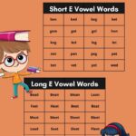
Ee Words 5 Letters